Work
GatherTogether Charity Campaign
Personal Project
Branding and Graphic Design

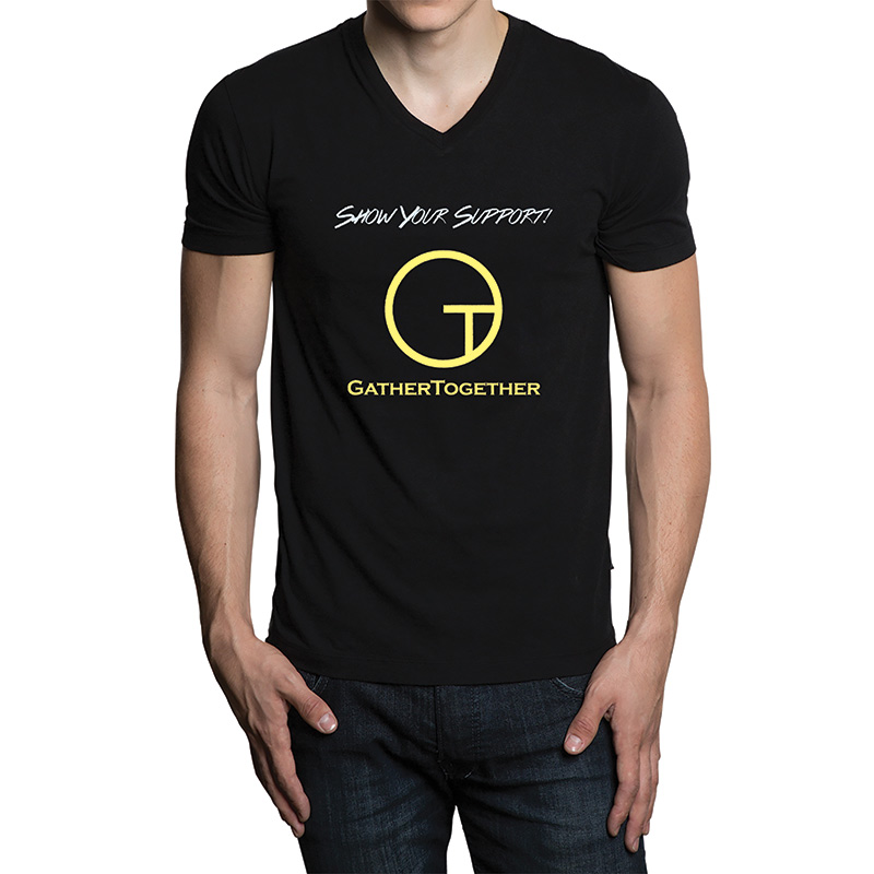
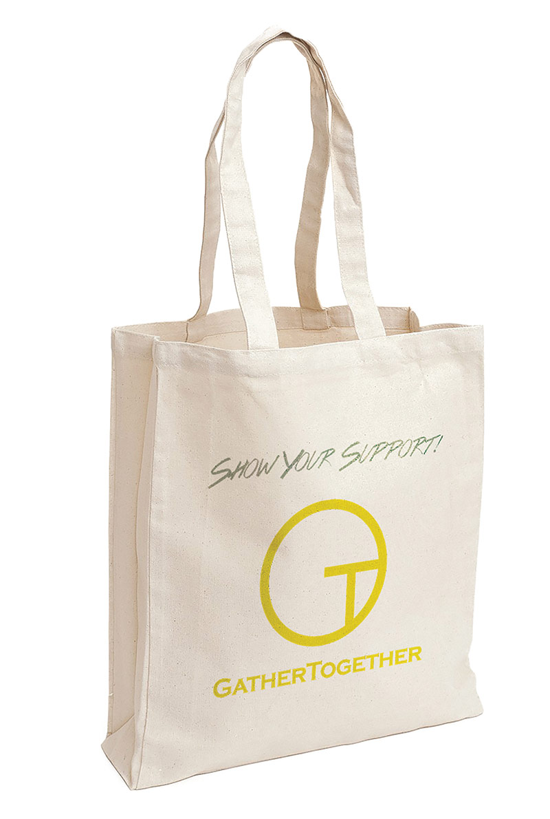
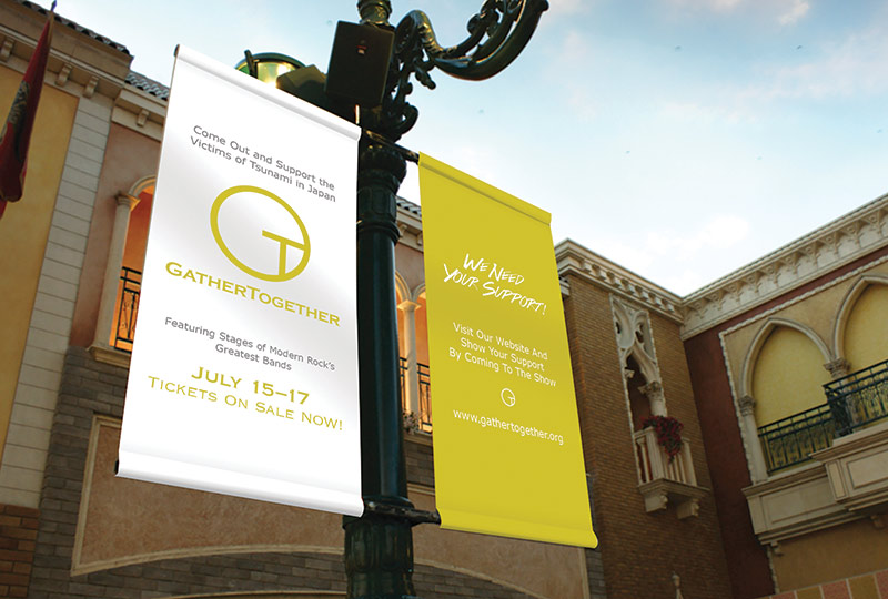
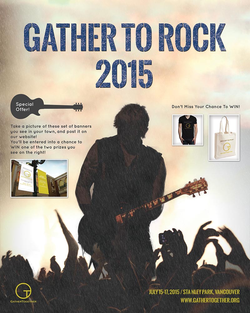
The objective of this project is to conceptualize a charity event, to create a logo for it, and to plan a campaign that goes with them. The topic I decided to do is "charity music festival", being inspired by many musicians who acted to support the victims who suffered from the earthquake and the tsunami that hit Japan in 2011.
The logo contains 3 key aspects: colour, shape, and simplicity. The colour is chosen to express the earthy, tenacious mood to try to show that nothing could really be done without a hard work. The shape represents unity and earth. The logo is simple enough to be seen from a distance, and still be able to identify it. The underlying letters of "G" and "T" are also simple enough to be seen right away from a viewer.
The campaign is delivered through the event's products, their banner ad, and their poster. The t-shirt and tote bag have consistent design elements, and the ad banner just simply conveys the information, repeating some of the design elements used in the products. The poster is design to express the heavy and dark mood, yet the shining neck portion of the guitar represents hope. The detail of the campaign is written on the poster as well.
Created in 2015
BRANDING / ART DIRECTION / DESIGN
My creative works
-
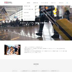
COS Educational Consulting Inc.
Website Design
-
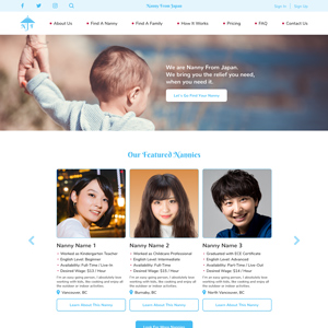
Nanny From Japan
Branding and Website Design
-

Planet B
Logo Design
-
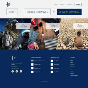
Planet B
Website Design Mockup
-
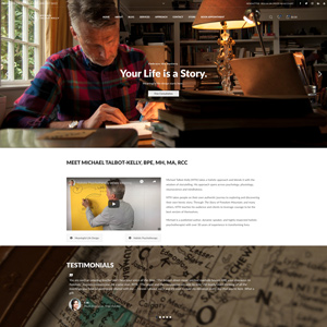
Michael Talbot-Kelly
Website Design and Development
-
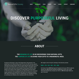
Natural Gifts Society
Website Design and Development
-
Project LOVE
Event Overview Video
-

Project IDENTITY
Campaign Video
-
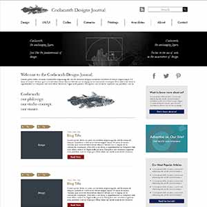
Coelacanth Designs Journal
Website Design Mockup
-
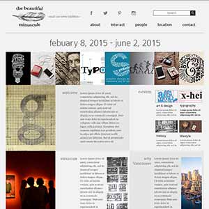
the beautiful minuscule
Website Design Mockup
-
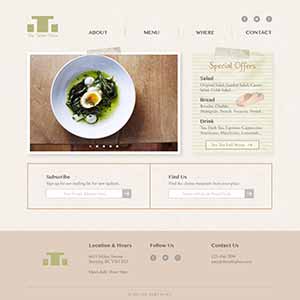
The Table Place
Website Design Mockup
-
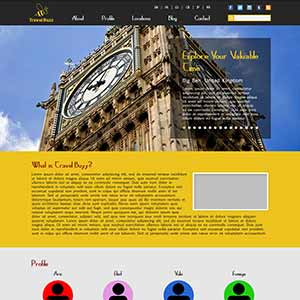
Travel Buzz
Website Design Mockup
-
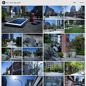
The Iris Gallery
Photography Website
-

musicRevolution
Project Website
-
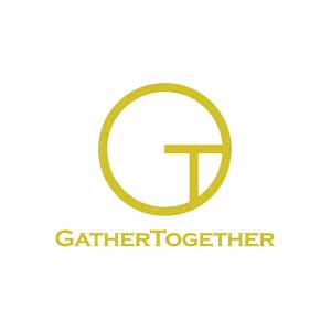
GatherTogether
Charity Campaign
-

"YM" Name Initial
Logo Design
-
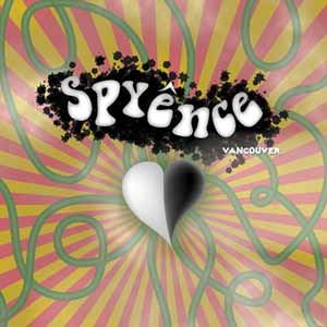
Psyence
Poster Design
-
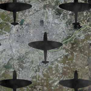
No More War
Concept Video
-
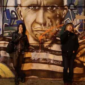
Usual, As Always
Short Movie
-
Frog Production Inc.
Promotional Video