Work
The Table Place
Personal Project
Website Design Mockup


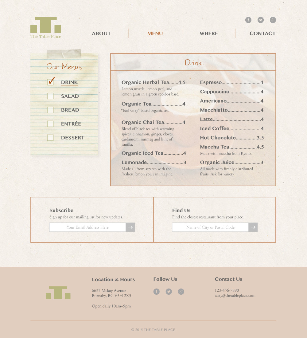


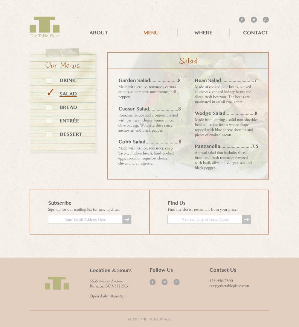


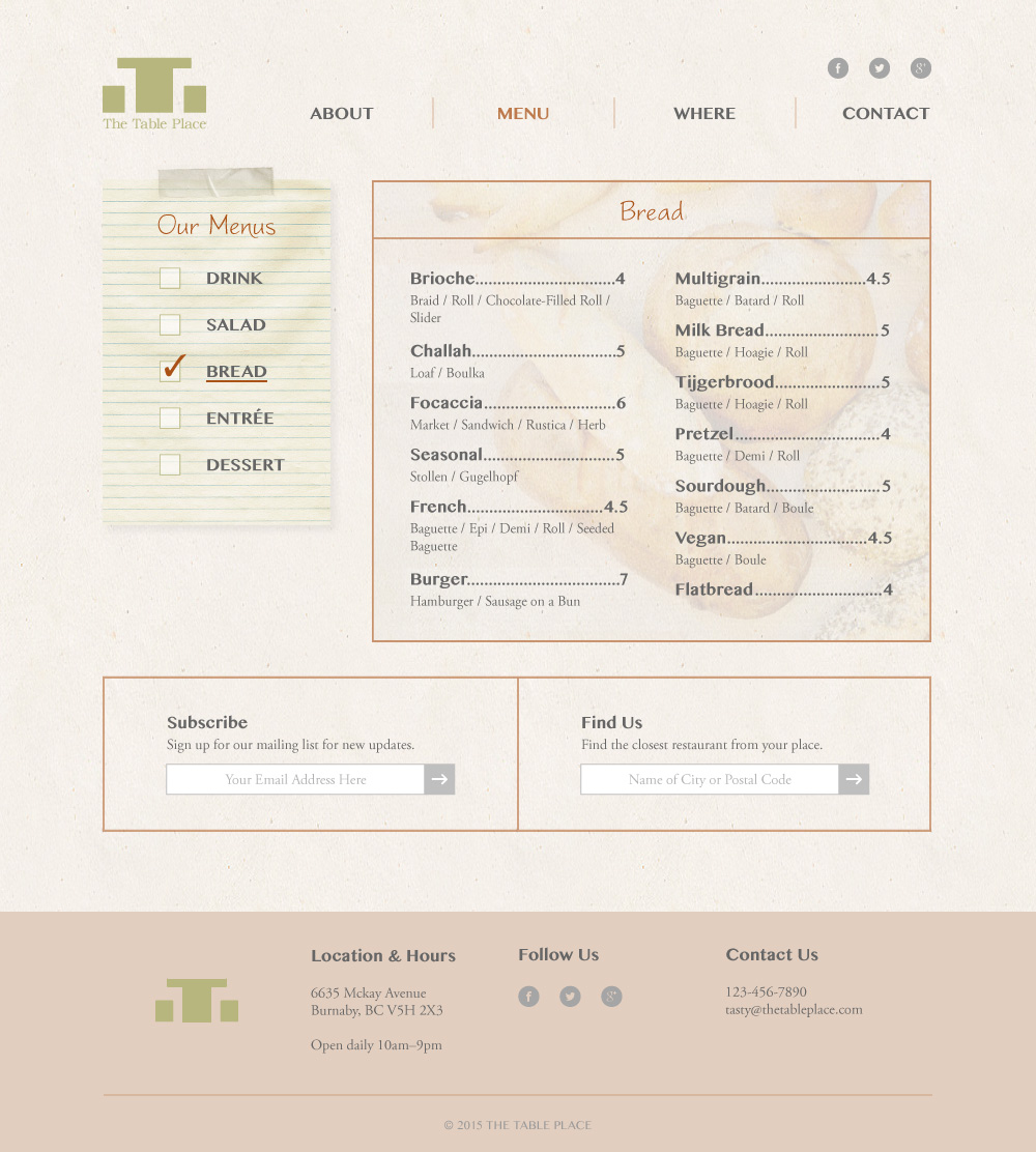

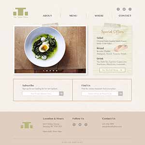
The Table Place is a fictitious organic restaurant that I created, and this is a design mockup for the website. Organic being the keyword here, I utilized texture, tape image, and note image in the background to express the realistic look of a wall in the restaurant. Along with the main contents, each page contains a section to promote email newsletters and a section to help the users out in finding the closest restaurant from where they may be.
The challenge was to bring together the realistic and rich looking interface, and simplicity at the same time. To overcome this, I assigned realisticness to the graphics aspect, and simplicity to the layout aspect of the mockup. Although rich design isn't as popular as it used to be (with the emergence of flat design), sometimes it's effective to display information in this manner.
For the majority of the workflow, I used Illustrator to design this mockup. I usually use Photoshop for this kind of work, but I sometimes found it useful to have the vector based functionality instead of bitmap. As screen resolution on computers are getting finer every day, it's important for us as designers to understand what's the most effective and efficient way to achieve our tasks.
Created in 2015
BRANDING / ART DIRECTION / DESIGN
My creative works
-
COS Educational Consulting Inc.
Website Design
-
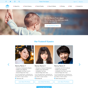
Nanny From Japan
Branding and Website Design
-

Planet B
Logo Design
-
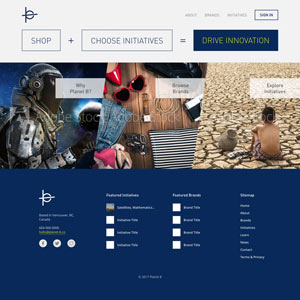
Planet B
Website Design Mockup
-
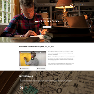
Michael Talbot-Kelly
Website Design and Development
-
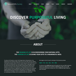
Natural Gifts Society
Website Design and Development
-
Project LOVE
Event Overview Video
-
Project IDENTITY
Campaign Video
-
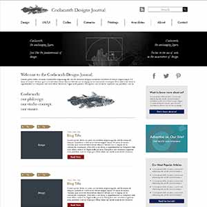
Coelacanth Designs Journal
Website Design Mockup
-
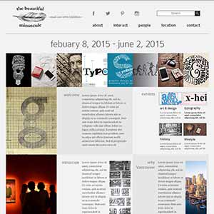
the beautiful minuscule
Website Design Mockup
-
The Table Place
Website Design Mockup
-
Travel Buzz
Website Design Mockup
-
The Iris Gallery
Photography Website
-
musicRevolution
Project Website
-
GatherTogether
Charity Campaign
-

"YM" Name Initial
Logo Design
-
Psyence
Poster Design
-
No More War
Concept Video
-
Usual, As Always
Short Movie
-
Frog Production Inc.
Promotional Video