Work
Nanny From Japan
Client: COS Educational Consulting Inc.
Branding and Website Design

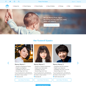
Nanny From Japan is a new service launched in 2019 by COS Educational Consulting Inc. based in Vancouver. Using this service, families living in Canada are able to explore for nannies to look after their children, interview candidates, and hire one. Since Nanny From Japan is an affiliated brand of COS Educational Consulting Inc., customers are also able to take advantage of the immigration consulting services provided by COS. In addition, caregivers in Japan are able to apply for work opportunities through this website.
As a designer of COS Educational Consulting Inc., I took on a role to come up with the information architecture, branding, and website design of this new service from scratch. One of the key characteristics of this particular service being that it mainly places experienced nanny caregivers from Japan, I incorporated some Japanese looks and feels as accents into the English website targeted towards audiences who are local families from various regions in Canada.
One element where the Japanese look and feel can be seen is the brand logo. A lot of people may think of an umbrella when they hear the word, “nanny”, but what is different about this logo is that it symbolizes a Japanese umbrella. This is a traditional type of umbrella used in Japan since the 1300s, and just by the look of it, we can recognize the difference of its look from the ordinary umbrealla that we use today.
Another element where the Japanese look and feel can be seen is the colour red that is used in a subtle way as an accent colour. However, this isn’t just any kind of red. The red accent colour used in this website is a traditional colour actually used in the national flag of Japan. This is technically called “beni-iro(紅色)”, which in English, the closest expressions are deep red, crimson, or vermillion. On the NFJ website, this accent colour is most prominently used on the global navigation section. Here, the beni-iro is used on the round bullets, which is also a symbol of Japan, derived from the national flag (the rising sun).

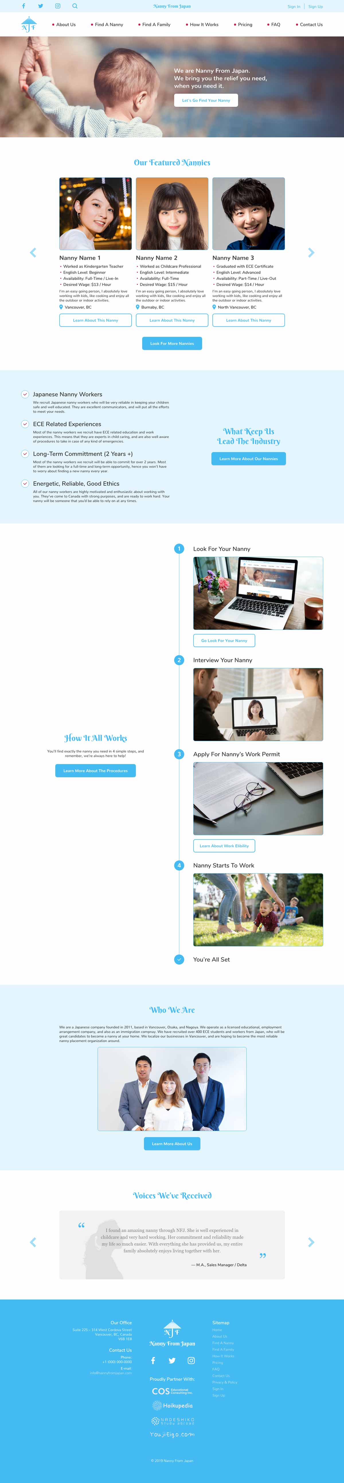


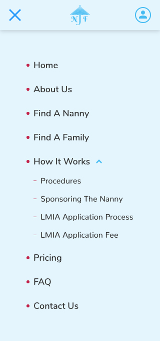
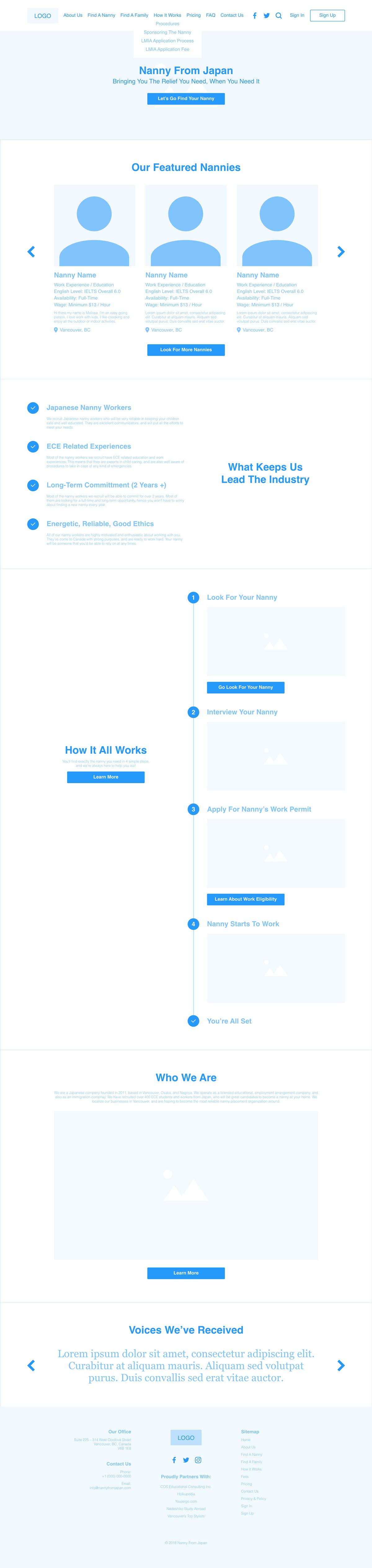
The initial concept of this website was to cover the entire process of matching and placing a pair of family and nanny within this website. Hence, I approached the user flow and UI design as if this is a web app. I spent a substantial amount of time preparing the information architecture before starting the design, and went through multiple phases of discussions and confirmation with the team. In the design phase, on top of polishing the look and feel of the overall website, a lot of work was put into building the filter on the search page and the user flow of the interview booking process. A lot of these functionalities that can be seen on the design prototype are not yet developed on the launched website, due to budgetary reasons.
Created in 2019
INFORMATION ARCHITECTURE / BRANDING / UI DESIGN / ART DIRECTION
My creative works
-
COS Educational Consulting Inc.
Website Design
-
Nanny From Japan
Branding and Website Design
-

Planet B
Logo Design
-
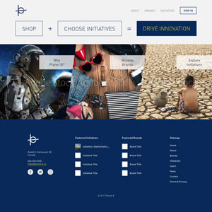
Planet B
Website Design Mockup
-
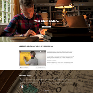
Michael Talbot-Kelly
Website Design and Development
-
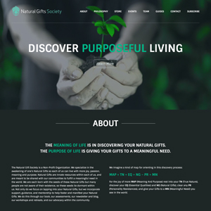
Natural Gifts Society
Website Design and Development
-
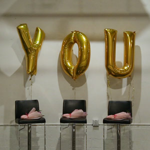
Project LOVE
Event Overview Video
-

Project IDENTITY
Campaign Video
-
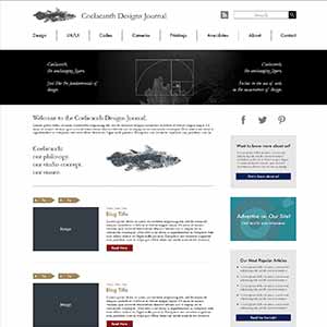
Coelacanth Designs Journal
Website Design Mockup
-
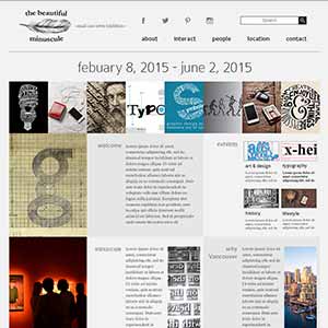
the beautiful minuscule
Website Design Mockup
-
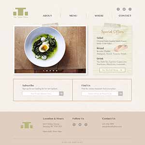
The Table Place
Website Design Mockup
-
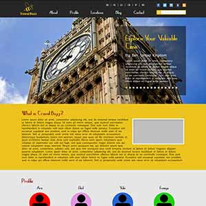
Travel Buzz
Website Design Mockup
-
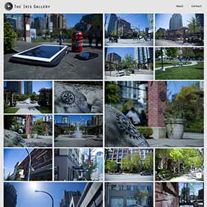
The Iris Gallery
Photography Website
-
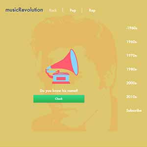
musicRevolution
Project Website
-

GatherTogether
Charity Campaign
-

"YM" Name Initial
Logo Design
-
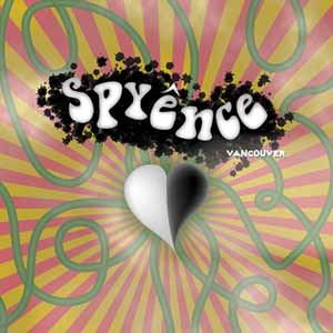
Psyence
Poster Design
-

No More War
Concept Video
-

Usual, As Always
Short Movie
-
Frog Production Inc.
Promotional Video