Work
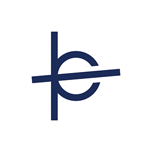
Planet B Logo
Client: Planet B
Branding and Graphic Design
Planet B is a startup organization that I take part in as a lead designer. The organization focuses in crossing over the industries between e-commerce and crowdfunding, and we’re trying to be something that will bring positive impact to the world we live in through consumerism and sustainability. Planet B is still in its developing stage, and we are working to launch it in the next year or so. As a designer I’ve been in charge of designing the logo and the website design, and this page is about the logo.
The logo work is still in progress, but I’ve come up with various versions, including the one that I believe is the strongest out of all so far, shown below.

This logo works for the following reasons.
First of all, it’s simple. It’s simple and flexible enough to be presented in bold, and also in light strokes if needed. With its simplicity and boldness, the logo will be recognizable in cases when it’s printed on tiny objects like a pen or a USB thumb drive, or when the logo is only visible in a far distance. With the logo being able to be presented in a bold stroke, it also conveys the sense of impact, which is something that we want to give to the not only the industry, but to the world we live in. Another reason why I’ve left the default version with some boldness is so that the look and feel won’t get outdated after time. I’ve designed it not to follow the current trend, but to be the symbol of who we are in the long run. In terms of flexibility, the logo has exactly the same ratio of the length and the width, so that it will be adaptable in various occasions and media use.
Second, the logo represents who we are. It contains the letters “p”, “b” (for Planet B), with slightly slanted horizontal line as the planetary ring on them to demonstrate the shape of a planet. The planet in this logo is a symbol of “futurism” and “environmental sustainability”, which is a big portion of the vision that Planet B holds.
Lastly, this logo is unique. I’ve played around with the logo to add some meaning into some of the elements, and to avoid cliché. The horizontal line for the ring is slightly slanted to show the sense of movement and action, and although this single line is what changes this logo into something with the shape of a planet from just being the combination of the letters “p” and “b”, it doesn’t make the appearance of the planet too obvious (like with the orbital ring). You need to look into it and observe for a second to clearly visualize all the elements, “p”, “b”, and the planet. I like this idea of having the visual of the planet not too obvious because it adds deepness into the logo, rather than actually having an obvious graphical presentation of a planet with the orbital ring for example (similar to the idea with the arrow in the FedEx logo).
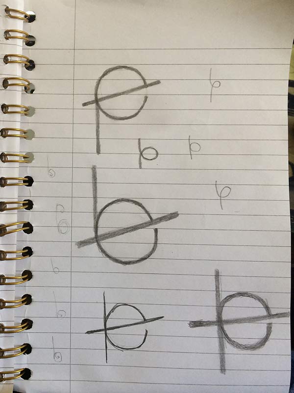
The logos were first sketched out roughly with a pencil and a paper for brainstorming purpose. This process helps me to quickly record ideas that pop into my mind. At this point, I value quantity over quality, so rough sketches are enough, as long as I’m able to leave the ideas on paper.
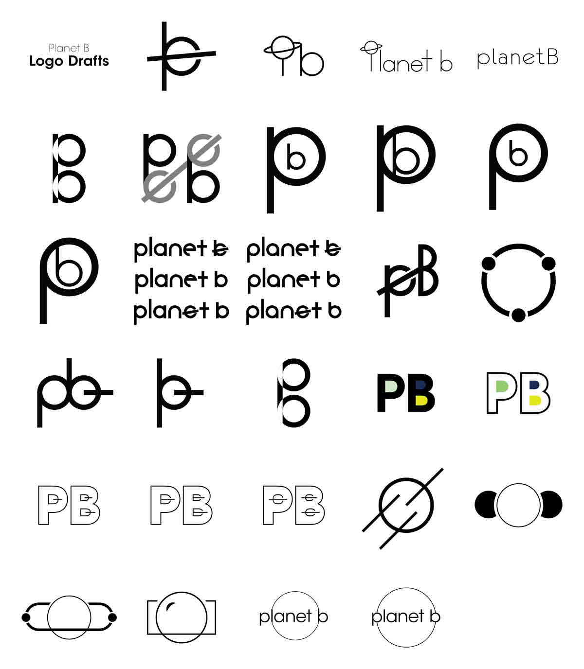
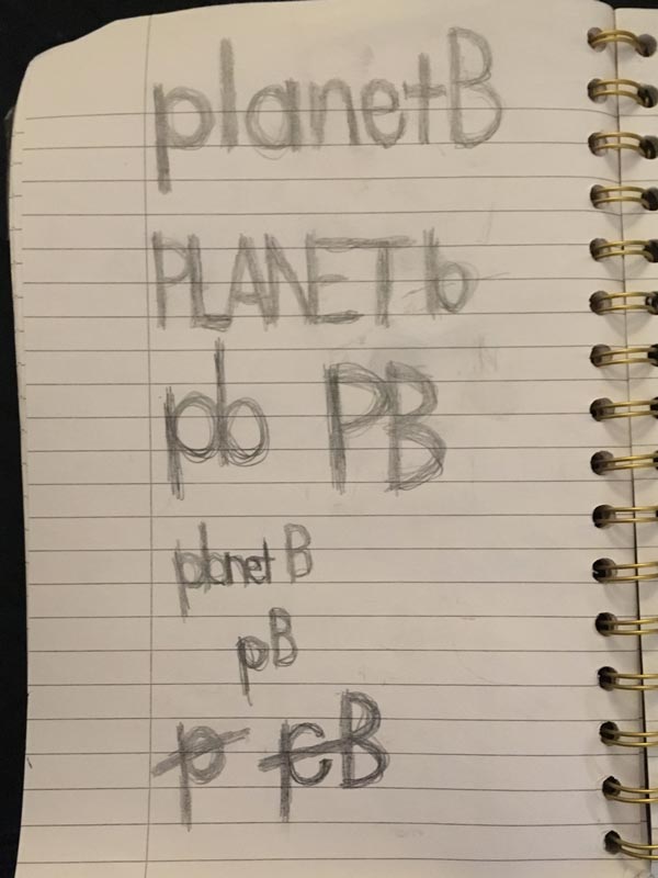
With the first draft, I’ve created a digital version of most of the sketched out logo ideas. Still, quantity is important at this stage to narrow down the options based on opinions given from the team.
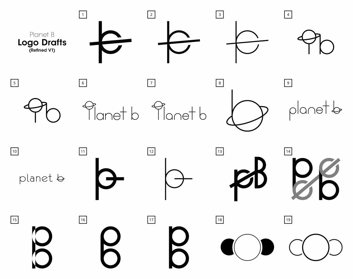
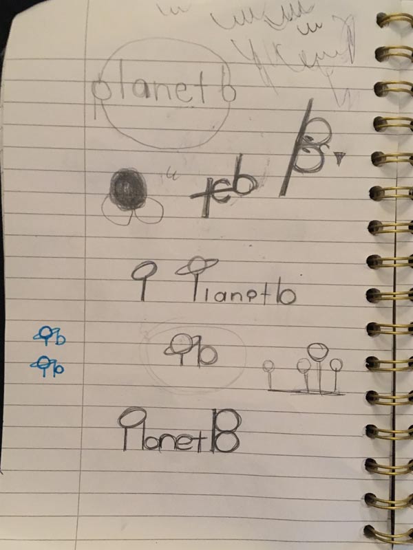
The second draft contains narrowed down options from the first draft. Also, iterations with minor changes are added to certain logos that the team members were digging into. Here, I’ve put more weight on the quality of each of the logo, and looked into the details for any minor adjustment to be made.
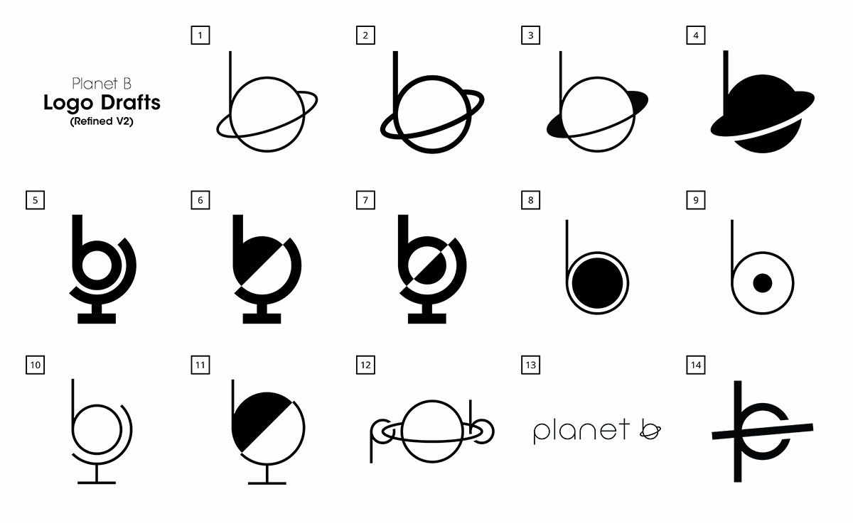
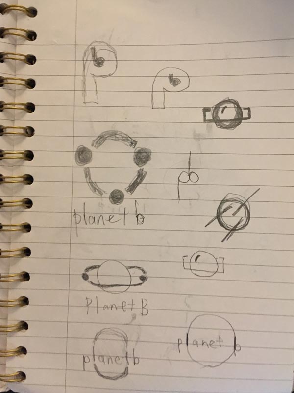
The third draft contains even more narrowed down options, and polished down versions of them. I've also added some more newer options that popped up to my mind, to consider for as a team. The draft contains the least amount of logo options so far, meaning that we're limiting our thoughts on the specific ones that we like as a team.
After this stage, I’ve selected my personal preference, not just because of the look of it but considering “what could be a strong and long lasting logo” from an object perspective, and presented it to the team.
Ongoing project as of 2018
BRANDING / ART DIRECTION / DESIGN
My creative works
-
COS Educational Consulting Inc.
Website Design
-
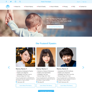
Nanny From Japan
Branding and Website Design
-
Planet B
Logo Design
-
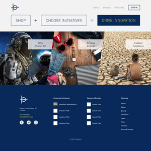
Planet B
Website Design Mockup
-
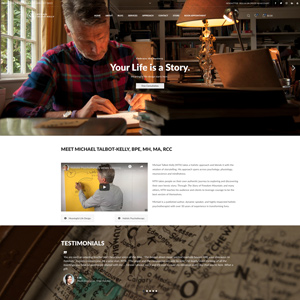
Michael Talbot-Kelly
Website Design and Development
-
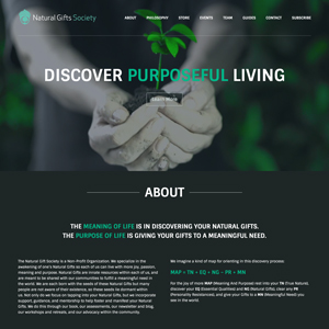
Natural Gifts Society
Website Design and Development
-
Project LOVE
Event Overview Video
-
Project IDENTITY
Campaign Video
-
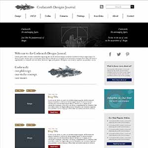
Coelacanth Designs Journal
Website Design Mockup
-
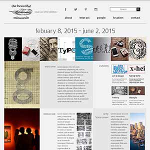
the beautiful minuscule
Website Design Mockup
-
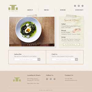
The Table Place
Website Design Mockup
-
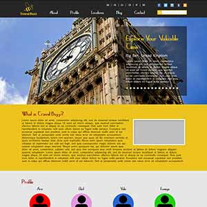
Travel Buzz
Website Design Mockup
-
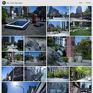
The Iris Gallery
Photography Website
-
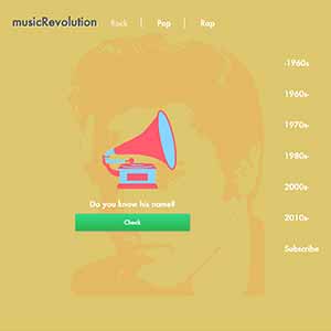
musicRevolution
Project Website
-
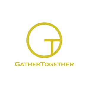
GatherTogether
Charity Campaign
-
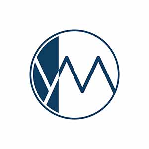
"YM" Name Initial
Logo Design
-
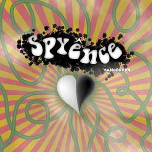
Psyence
Poster Design
-
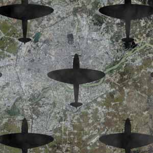
No More War
Concept Video
-
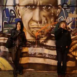
Usual, As Always
Short Movie
-
Frog Production Inc.
Promotional Video