Work
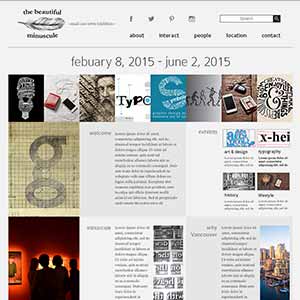
Small Is Beautiful Event Website -the beautiful minuscule-
Personal Project
Website Design Mockup

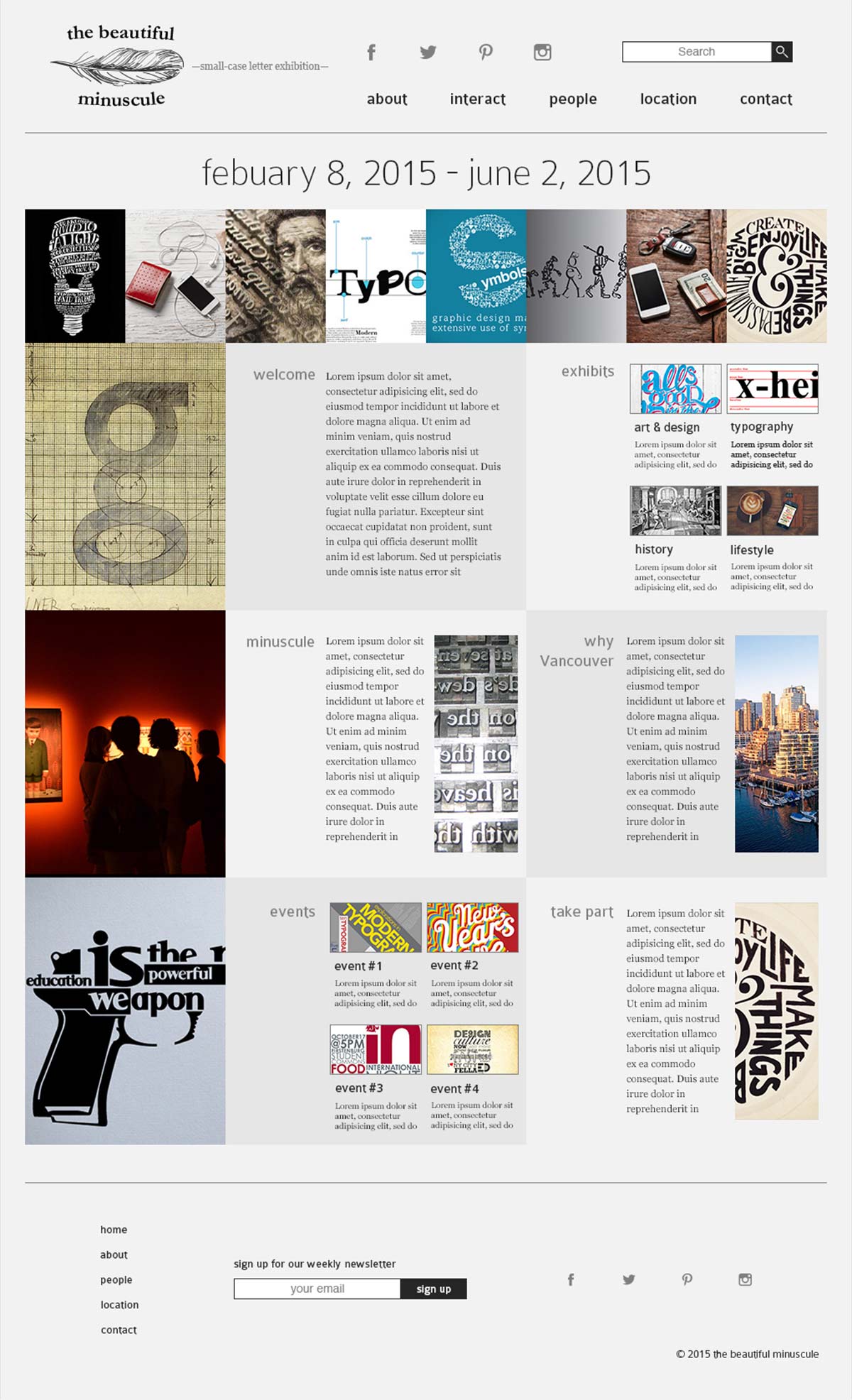


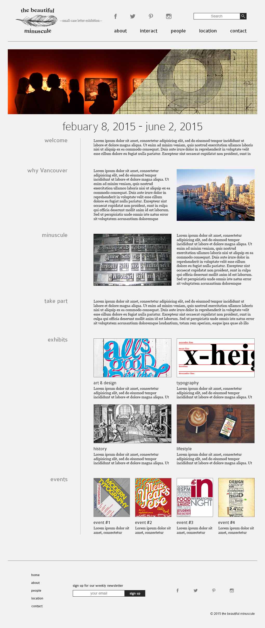

The objective of the project is to design a website for Vancouver’s first Small is Beautiful Event. We were given the opportunity to decide on whether the event will be a show, conference, meeting, or almost anything we like as long as it stays within the scope.
I chose to design a website for an event that will focus on the beauty and benefits of lower-case alphabet letters, called "the beautiful minuscule". Although from the subject matter it could be guessed that the event itself will attract more elderly people, one of the aims of the event is to get the younger people to be engaged and motivated about growing their own creative mind. The website being built in this project will be the key factor to pull attention of the younger generation audiences. One of the triggers for this is interactivity. The website has access to its social networking account through icons on the header and the footer, and it also contains a page that is fully dedicated to a topic about interaction.
The website is designed with the use of a grid. This structure of the grid is based on the actual type cases, since this plays a great role when dealing with letter cases. The terms "upper case" and "lower case" come from the physical type cases explained above.
The logo shows a feather. The feather is used to support the idea that "small case letters were developed for writing purposes". Upper case letters were primarily used for letter pressings, but people have later realized that this is not best used for writing.
In the design, only small case letters are used (except for paragraphs). This is intentionally done not only to bring sense of unity throughout the design, but also to describe how easy it is to read small case letters. A page filled with all capital case letters would be a pain to read, but a page filled with small case letters is not. The roundness and the tenderness of the type case makes it easy for the user to read.
Created in 2015
BRANDING / ART DIRECTION / DESIGN
My creative works
-
COS Educational Consulting Inc.
Website Design
-
Nanny From Japan
Branding and Website Design
-

Planet B
Logo Design
-
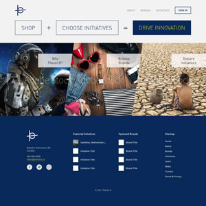
Planet B
Website Design Mockup
-
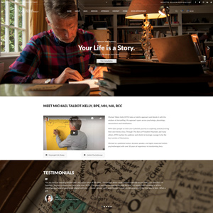
Michael Talbot-Kelly
Website Design and Development
-
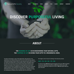
Natural Gifts Society
Website Design and Development
-
Project LOVE
Event Overview Video
-
Project IDENTITY
Campaign Video
-
Coelacanth Designs Journal
Website Design Mockup
-
the beautiful minuscule
Website Design Mockup
-
The Table Place
Website Design Mockup
-
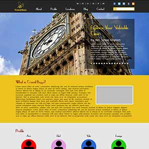
Travel Buzz
Website Design Mockup
-
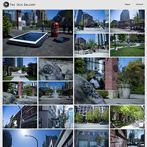
The Iris Gallery
Photography Website
-
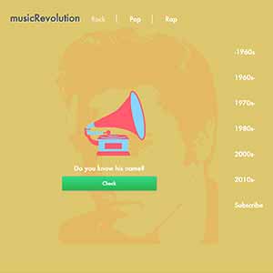
musicRevolution
Project Website
-
GatherTogether
Charity Campaign
-

"YM" Name Initial
Logo Design
-
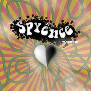
Psyence
Poster Design
-
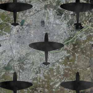
No More War
Concept Video
-

Usual, As Always
Short Movie
-
Frog Production Inc.
Promotional Video