Work
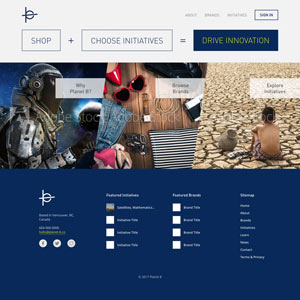
Planet B Website Design
Client: Planet B
Website Design Mockup
Planet B is a startup organization that I take part in as a lead designer. The organization focuses in crossing over the industries between e-commerce and crowdfunding, and we’re trying to be something that will bring positive impact to the world we live in through consumerism and sustainability. Planet B is still in its developing stage, and we are working to launch it in the next year or so. As a designer I’ve been in charge of designing the logo and the website design, and this page is about the website design mockup.
The website is still work in progress, including the mockup. There has been a number of design changes since the start of this, and we’ve settled for the current version for now. The development team is working to create a prototype test website based on this mockup, but the design may still change depending on the market research that the business development team is also working on.

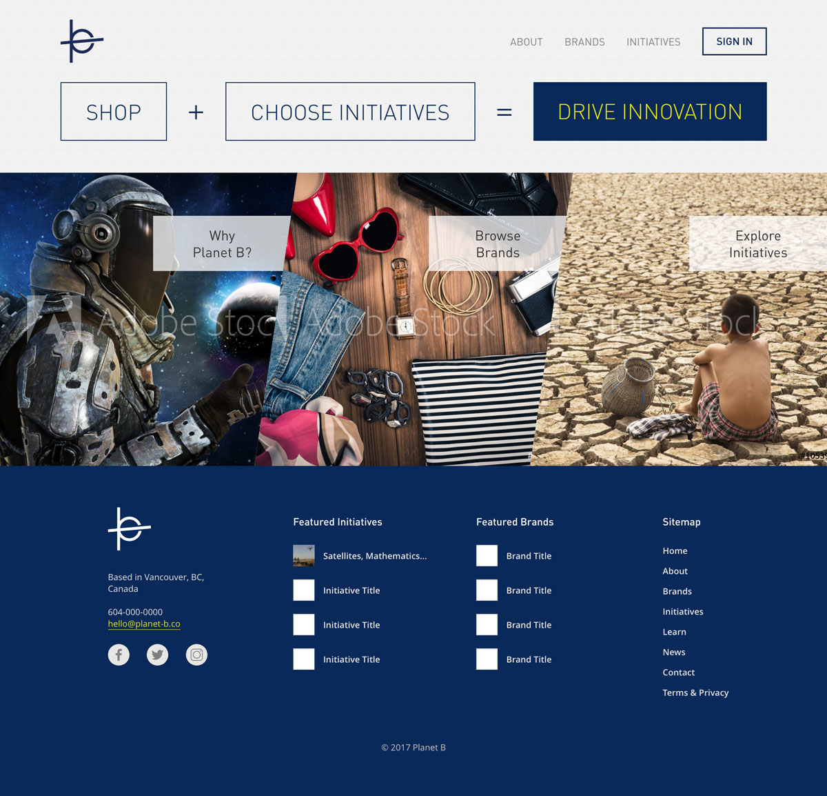

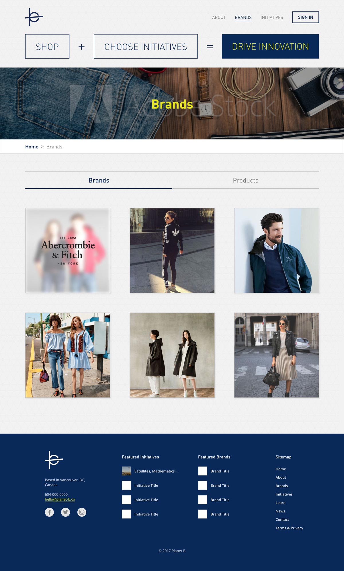
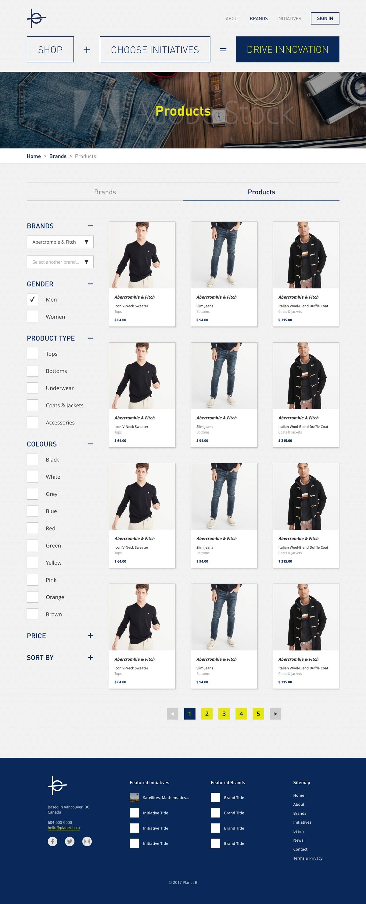
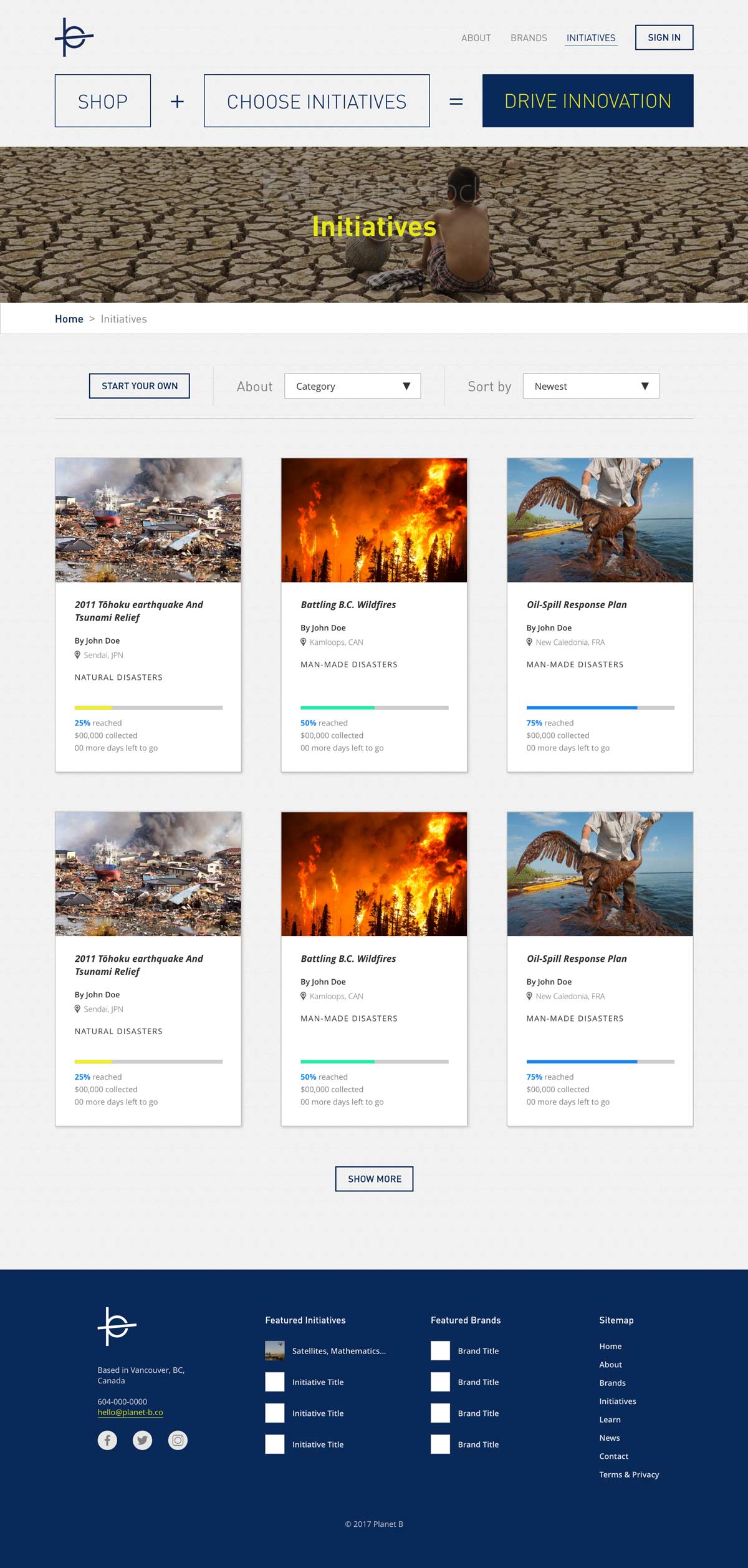

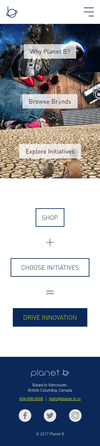

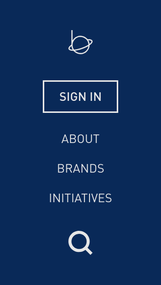
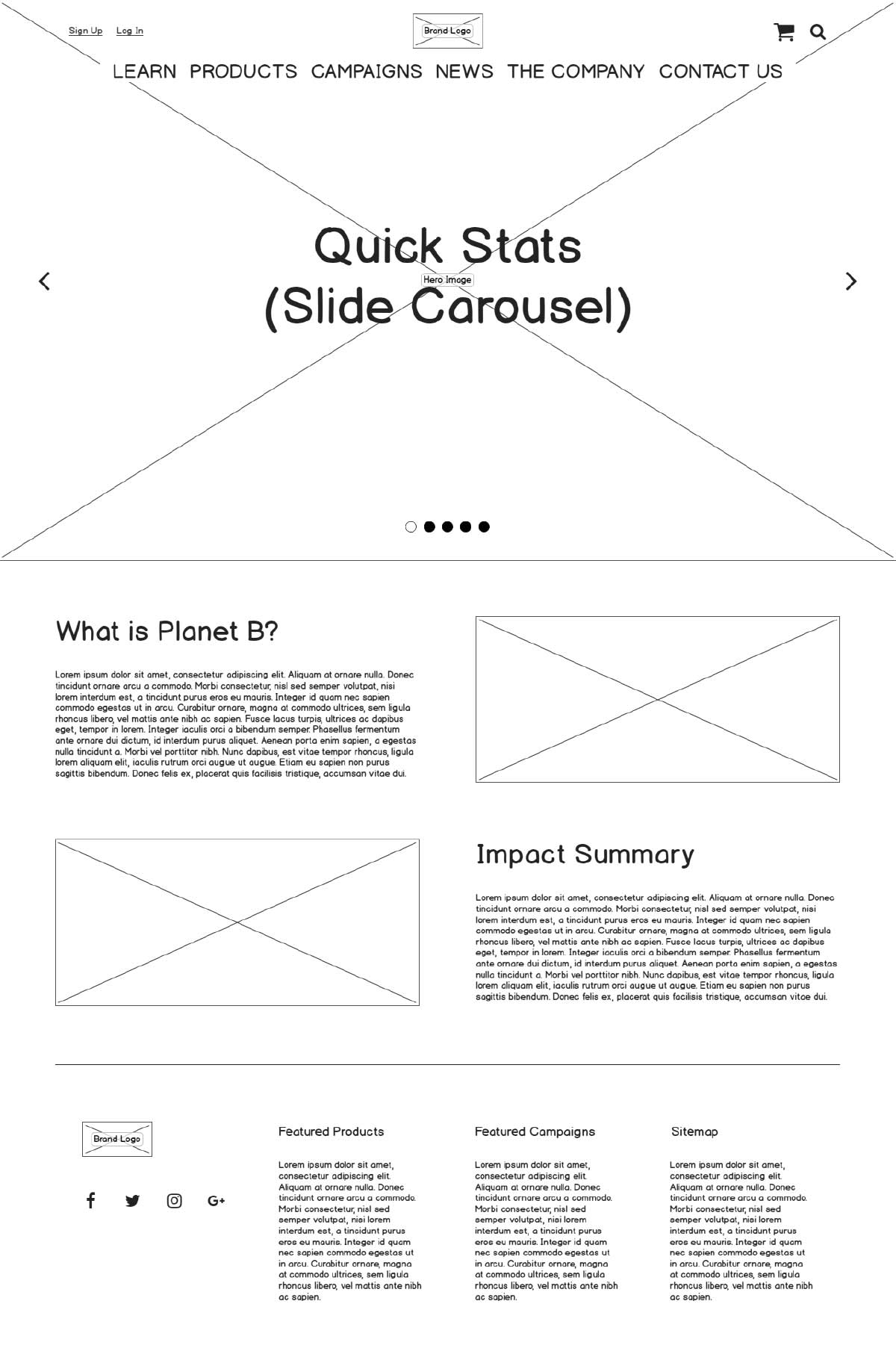
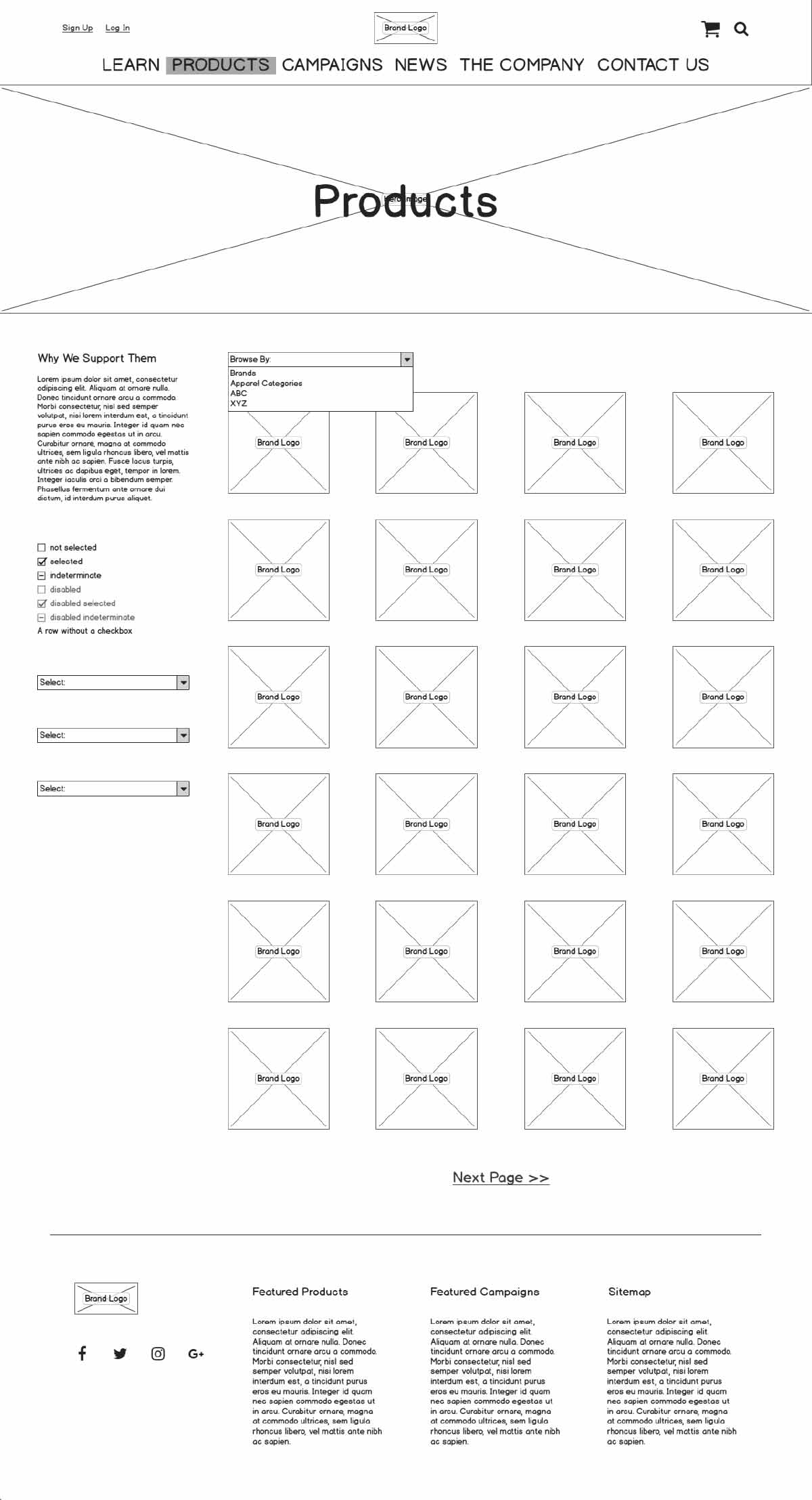
The home page is a simple 3 split view layout, guiding the users to 3 directions, About page, Brands page, and the Initiatives page. The goal of this website is to get the users to purchase products, just like in other e-commerce website, but by having them to choose on a campaign that we call “initiative” to contribute some portion of the payment into. Initiatives are crowdfunding campaigns to help solve problems caused by things like environmental or man-made disasters to improve global sustainability, and users will choose one of them before proceeding to the check out page.
The key in this website design is simplicity and ease of navigation. For example on the Home page, the user is given only 3 options, 2 of which guide them to the intended user flow of browsing brands/product or the initiative. Users visit the website for a reason, and it’s our job to direct them to what they came for with as less hassle as possible. Also on the Brands page, although users are presented with a list of brands before switching over to the Products tab, users will have the option to select the Products tab first to select from all brands using the filter on the sidebar. The idea demonstrated here with these examples of showing users the road map to navigate through the site, but also giving them alternate option, is one of the key aspects that I took into account as I thought through about the user experience.
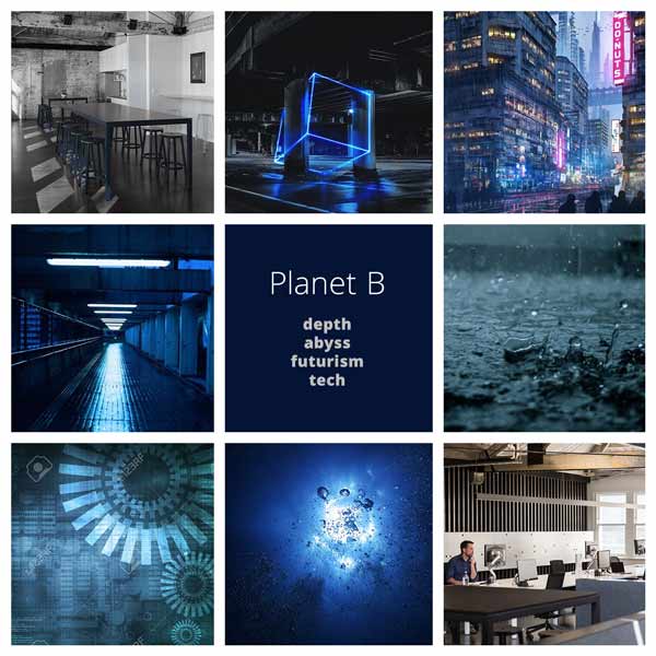
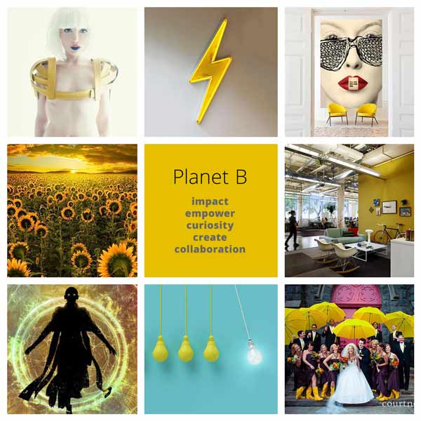
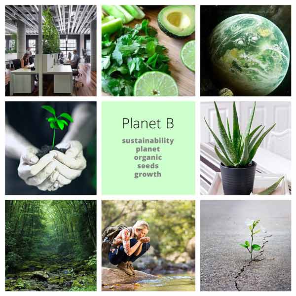
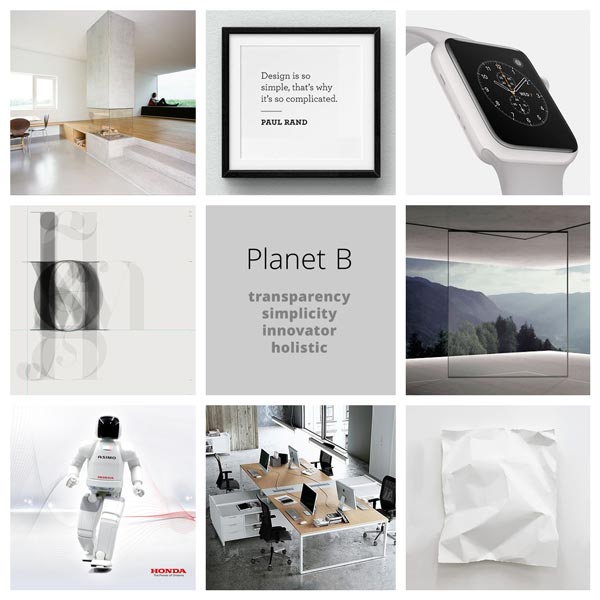
The look and feel, including the colour selection is done based on the mood boards that I created prior to coming up with the mockup drafts. I gathered some keywords from the team that describes who we are or our vision, and grouped them into 4 categories to create a mood board for each of them. The team agreed on “Depth” and “Impact” ones being closest to our vision, which were then carried over into the website design.
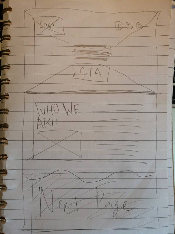
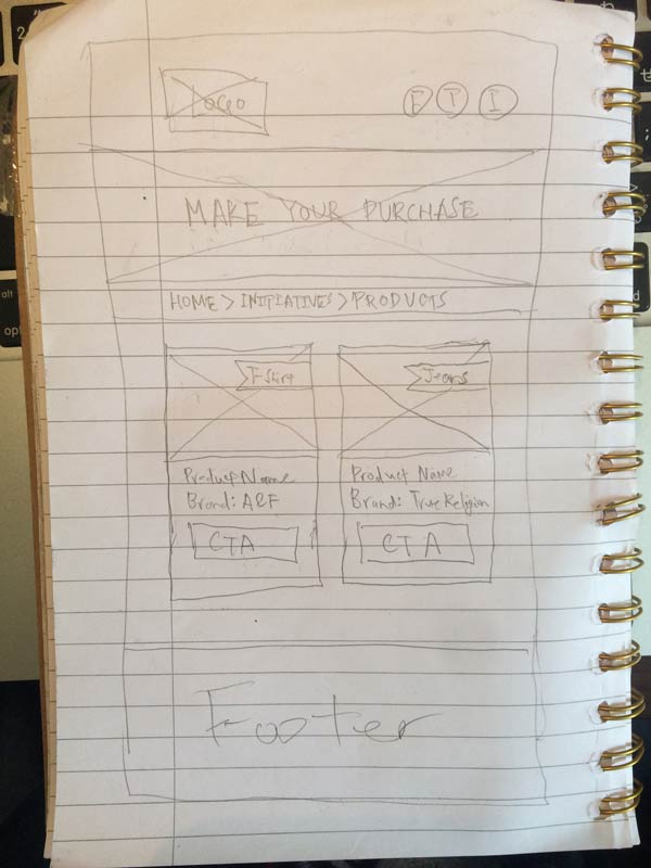
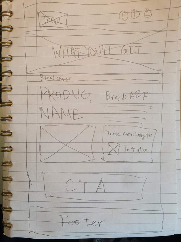
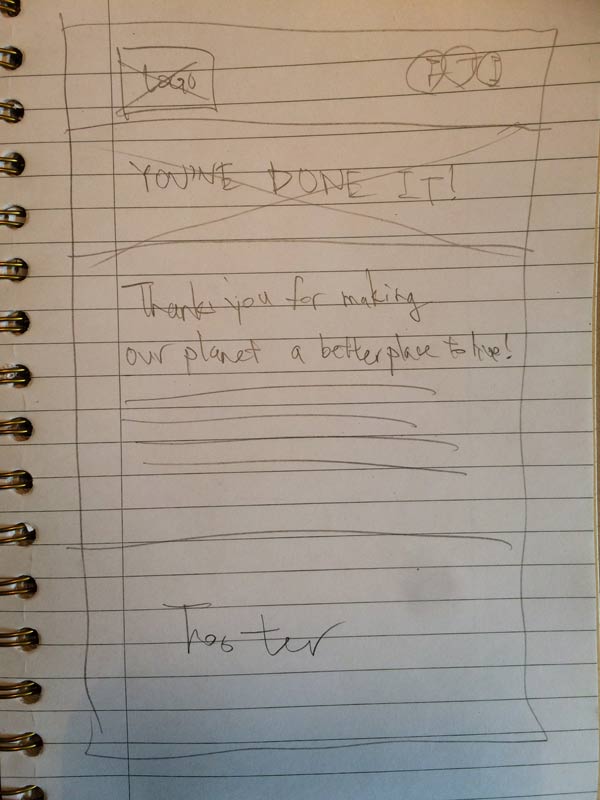
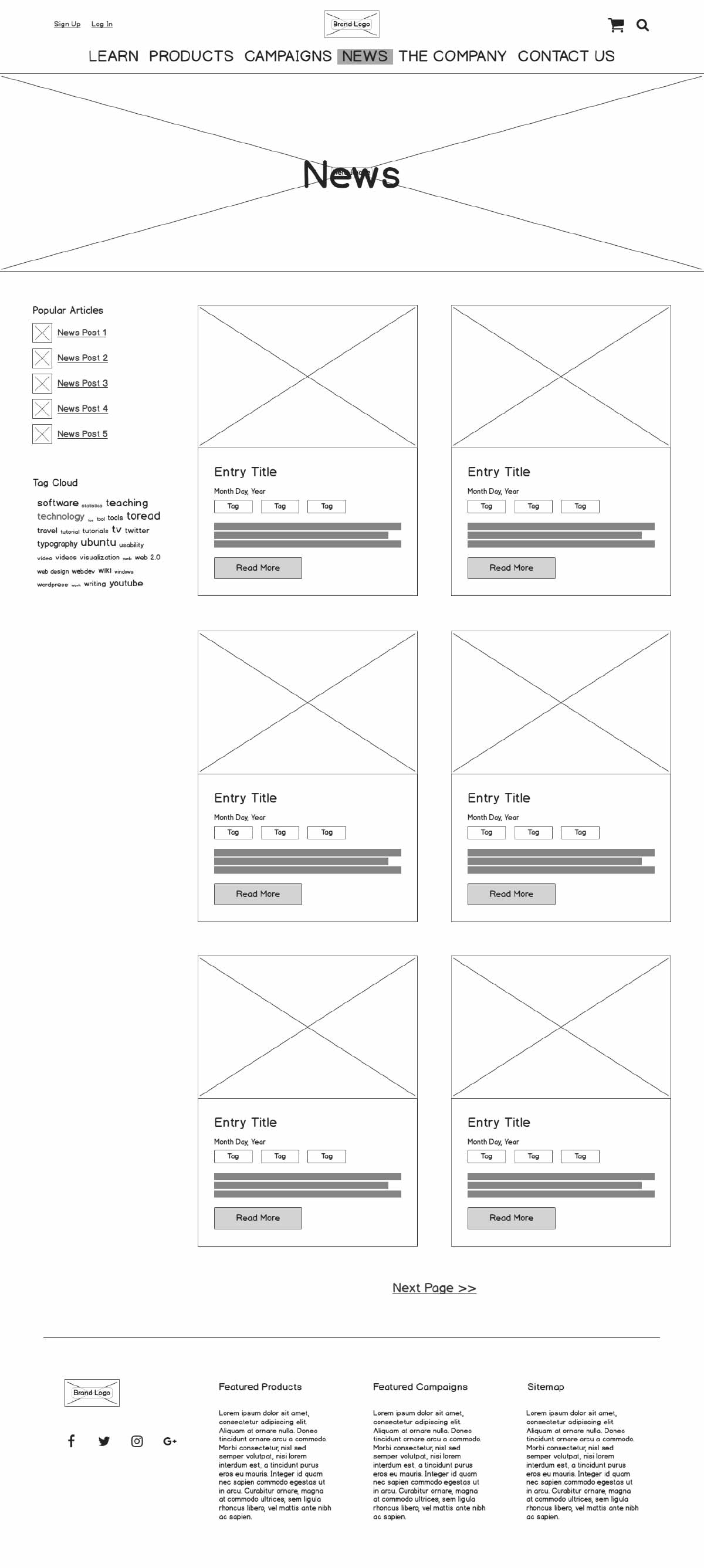
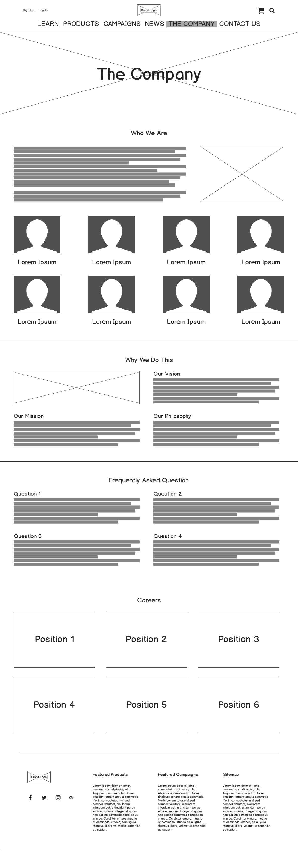
The wireframes were done in two steps. First, I drew out rough sketches to get the team’s input. Then, I created a digital version that corresponds to it. Although some changes to the website layout and structure were made after this process, the core skeleton of it was developed at this stage.
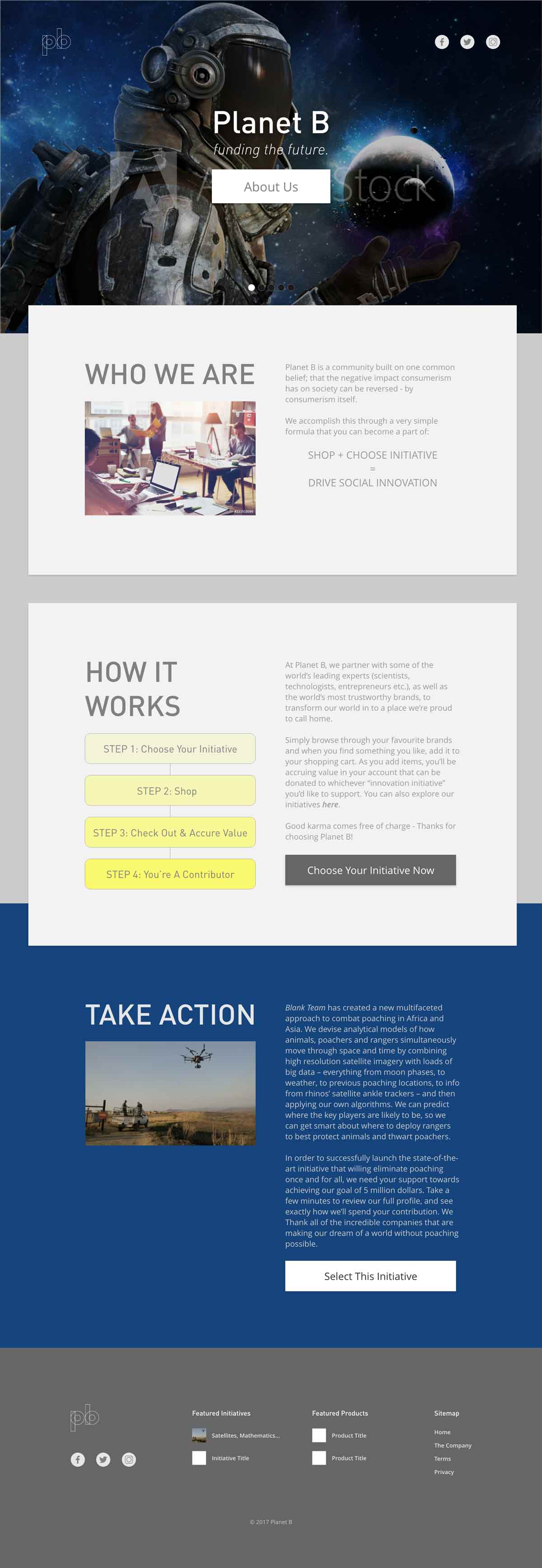
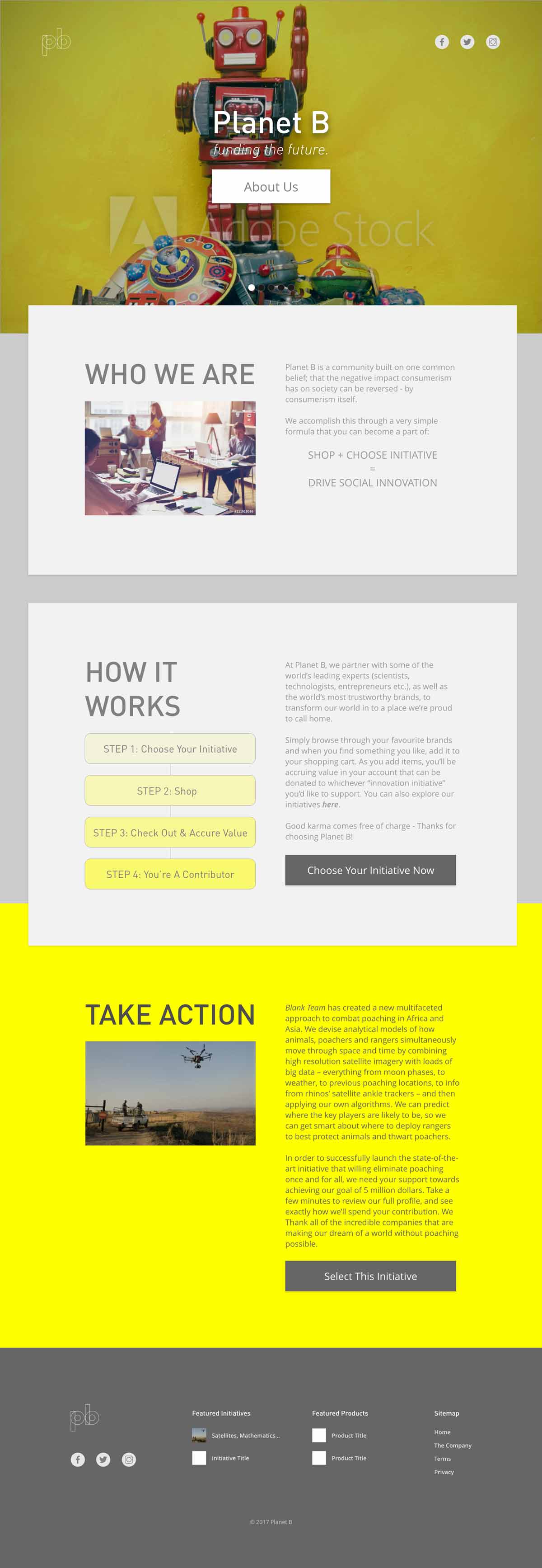
Different iterations of mockups were created before getting to the current version above. First few versions of the mockups are very minimal with flat above the fold layout, taking in only 1 colour scheme from the mood board presented above. The 3 split view layout was adopted later on after gathering some opinions from the team, and also decided on using dark blue (from the Depth mood board) as the main colour and yellow (from the Impact mood board) as the accent colour.
As the website will be the first thing that most of our potential customers will reach, it needs to reflect our brand identity and have outstanding UX strategy in it. As the brand grows bigger and changes its form, the website will most likely be enhanced to best meet the needs of the users at that point.
Ongoing project as of 2018
INFORMATION ARCHITECTURE / BRANDING / ART DIRECTION / DESIGN
My creative works
-
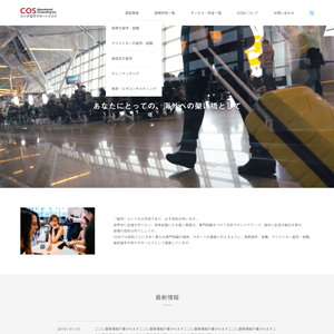
COS Educational Consulting Inc.
Website Design
-
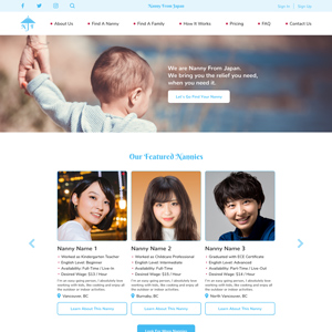
Nanny From Japan
Branding and Website Design
-
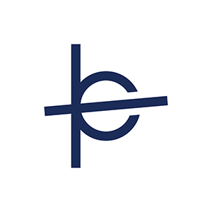
Planet B
Logo Design
-
Planet B
Website Design Mockup
-
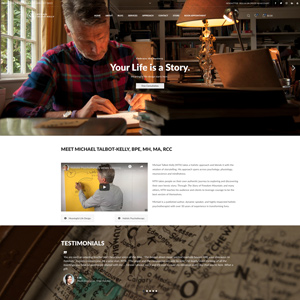
Michael Talbot-Kelly
Website Design and Development
-
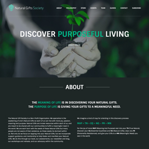
Natural Gifts Society
Website Design and Development
-
Project LOVE
Event Overview Video
-
Project IDENTITY
Campaign Video
-
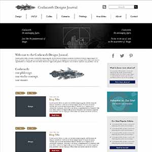
Coelacanth Designs Journal
Website Design Mockup
-
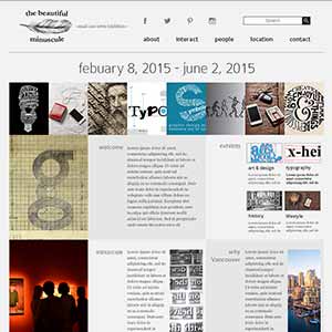
the beautiful minuscule
Website Design Mockup
-
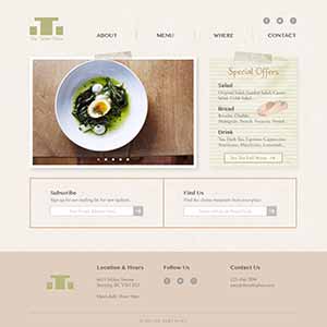
The Table Place
Website Design Mockup
-
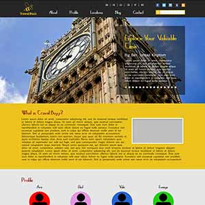
Travel Buzz
Website Design Mockup
-
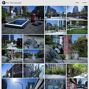
The Iris Gallery
Photography Website
-
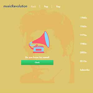
musicRevolution
Project Website
-
GatherTogether
Charity Campaign
-

"YM" Name Initial
Logo Design
-
Psyence
Poster Design
-
No More War
Concept Video
-
Usual, As Always
Short Movie
-
Frog Production Inc.
Promotional Video